The article talks about typography and it’s importance in magazine covers. The most important headlines as well as titles have to be in a large font. In addition to this, the text must be contrasting. This means that there must be light text on a dark background or the other way around. The color scheme is another valuable element, so I’m going to start looking at color themes for the cover. Since I am considering doing a summer issue, I will be focusing on summer colors.
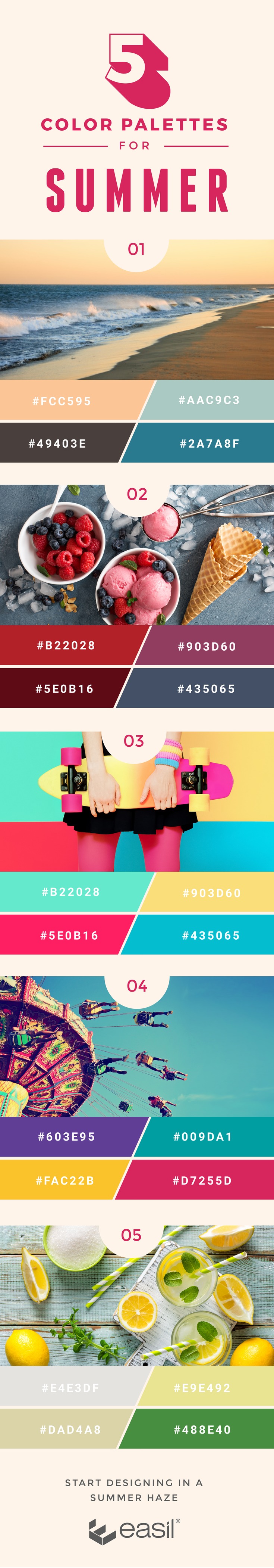
Pictures #3 and #4 display bolder and brighter options, while Picture #1 has a more subdued color scheme. Although summer issues usually have very bright colors, I love the beachy tones of the second palette as well.
The website also suggested the ABC rule, which includes the title (A) , one main subheading (B), and a couple more subheadings (C). This will be helpful in helping me to have a clean layout for my magazine.
Now I'm going to take a look at some of the template options on Canva to see if I might be able to use them as a guideline for my cover.
I liked the first cover because of how it makes use of space. In the aforementioned article, they spoke about creating or using blank space to put your font on if the colors or other elements don't match up. The picture itself is lower on the cover, with the top portion blank for the title, drawing focus to it. It's simple and understated yet also clean and visually pleasing.
I really like the second cover because of how unique it looks. The contrast created with the one colored portion of the cover is interesting. And the focus of of the black and white picture that is in the center but doesn't take over the whole page is nice as well. The organization of the headlines on the bottom is different and an interesting idea.
The third cover may be one of my favorite templates. Like the previous one it's simple and understated, but it still manages to be bold with the large block colored font. If I did something like this, I would most likely add more color to it but the general organization of it is beautiful to me.
Sources:
5 Color Palettes for Summer-Ready Design (and What Makes Them Work). (2017, December 03). Retrieved from https://about.easil.com/5-color-palettes-for-summer-ready-design/
5 Color Palettes for Summer-Ready Design (and What Makes Them Work). (2017, December 03). Retrieved from https://about.easil.com/5-color-palettes-for-summer-ready-design/
No comments:
Post a Comment