Wednesday, March 27, 2019

TOC part 2!

Hello! For this posting, I'll be working on constructing my table of contents as my cover is basically finished! I already had a template for my TOC, so all I have to do now is input my information.

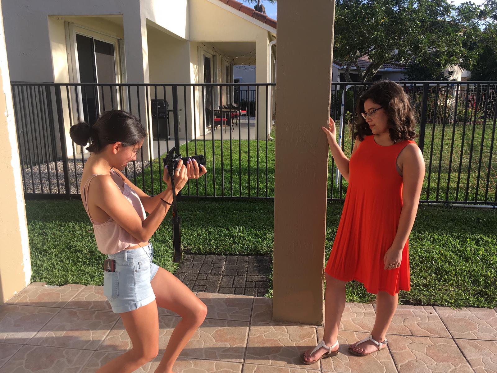
I decided to switch up the picture collage template already present on Canva. It was hard to work with this collage as it didn't necessarily suit the pictures I have. It was somewhat harder than I anticipated to make my pictures and headings work with the template. I started inserting pictures and found the following four that I decided to utilize for this page (with respective headlines):

 staying waterproof at the pool!
 how color can change your life (2-page spread)
 how to keep those beachy waves
how to get tropical close to home


I organized these on the left-hand side of the page, then started organizing headline sections. I studied tables of contents in magazines such as Vogue to get inspiration for mine. Issues of Vogue have sections such as Every Issue and Seasonal that I decided to imitate for my magazine. Since my magazine is seasonal, I felt these sections would be fitting. 

This is an example of my table of contents while still in the works, with some of the past template still included. As can be seen, I organized three sections, On the cover, Seasonal Tips, and Style (which later turned into Every Issue as I mentioned previously). I am in the process of adding more headlines and adding page numbers. I also decided to make the TOC page the same color as the font of my cover page for continuity purposes. This color is part of my magazine's theme, as it is a very summer like color and bright and attractive. I kept the font I am going to use for my subheadings on my cover page as well, Cantata One. The smaller font is Libre Baskerville. 

I'm going to be finishing up my TOC and moving on to my double page spread now. :)

Monday, March 25, 2019

more pics!

 In a previous posting, I talked about why I chose to photograph a picture in a certain way. For this posting, I'll be going more in-depth into why I chose to take certain pictures the way I did. These are pictures that I edited and may be using for my spreads. I will also be talking about why I edited pictures in the way I did. 


1. This picture is displaying an outfit that I used for the cover of my magazine, on a different background. This picture is not part of the main article, as it is not mainly color related. For this picture, I photographed against a white wall, with the windows open to improve the lighting. I turned the camera to the side so it would be a vertical picture and took it from a lower angle. This made the model appear taller and emphasized the long skirt she was wearing. Her posture is relaxed and shows the slit in the skirt, which goes with the picture. I edited to make the colors appear brighter and make her stand out from the wall.


2. For this picture, I decided to utilize the leaves in my backyard to make the picture more visually interesting. The color in the leaves, as well as the shadows created by them, add an artistic aspect to the picture. The green shirt the model was wearing was matching with the leaves, which I emphasized by a green effect on the picture. I also centered the model in the middle of the photo to make her the focus. And, I had her smile for the picture as this matches the tone of the photo and goes with the sunny aspect coming in from the left.


3. To edit this picture, I added an orange effect. I did this with many pictures to emphasize the color being presented. I had the model use the column next to her to pose the photo better. I also took it from that angle to catch the sun's rays coming in from behind her. These made the picture more visually attractive and went with the vivid colors of the picture. 


4. I took this picture against a white wall to emphasize the colors in the model's outfit. Like in the other pictures, these colors were also emphasized by a pink color effect when editing. I increased the saturation to make these colors pop. The reason for her being in a corner of the room was so she could pose her hands and body in the way that she did, adding a certain tone to the photograph. This was taken head-on, at a bit of a lower angle. This angle also allowed her to pose her head as if looking off, which went with the tone of the picture. 


5. This picture is for one of my table of contents headlines. This was very hard to photograph because I had to ensure that I wouldn't be in the mirror in the picture. I wanted to be able to partly view the model in and out of the mirror, which I accomplished. However, I feel I should have tried to take it from a higher angle as it is somewhat awkward. Also, the towel showing in the background might not go well with the picture overall. I am still going to see if I can use it for my intended subheading, but it was definitely not the easiest picture to take. 

Thursday, March 21, 2019

cover part 2!

For this post, I'll be considering the cover design for my magazine. I already know the picture that I'm considering for this cover, so all I have to do is decide on a general design and color scheme. I'd already looked at cover ideas on Canva, and I want to use my favorite template, this sample cover

I removed the original information on the cover, but I do like the font style on it. I still had not decided on the name, so I made this choice to start planning. I like the Italian vocabulary in fashion as it is central in the fashion industry. However, I was worried that it would come off as difficult for those not familiar with the romance languages to understand. I liked stile (style), but that's already a word with another meaning in English. I also liked alta moda, but I'm aware that the meaning for that (high fashion) is hard to understand. So, I decided on the name Modello for my magazine. It is similar to the English word "Model" so I believe that it should be pretty easy for people to understand its relation to the fashion industry. 

As for color, I debated a lot on the different colors I could draw from. I wanted to make sure the colors I chose went with a summer look. I also wanted the color to go with something in the picture. This is an example of a summer toned color palette I found:

Image result for red pink color

from Quora

I like a color somewhere in between the salmon and coral shades, as I feel that they go with a color in the picture I'm considering. So for now, I found a color like this in the Canva font color options. It's a bit brighter, but it has summer tones. If I was to change my idea for the cover picture, I would most likely change this color. So for now, I have my title in place, with the general format, I just need to place my picture and headlines. 

I'm in the process of editing my picture, so I need to figure out what headlines will be on my cover. I've decided one these headlines so far:

how to keep those beachy waves all summer
fitness tips to keep your summer bod
sundresses and more!
- staying waterproof at the pool!
- 50 beauty secrets to stay in style

And then the main headline, "How color can change your life"

As soon as I finish deciding on my cover picture, I will update on the new version of the cover! This is the current version: 

Wednesday, March 20, 2019

revising!

Last night, I posted about the writing process of my article and how I utilized my interview information. So today, I shared this draft with my teacher so she could give me some general advice on how to improve my writing. She said several things to me that were very helpful in revising my article. Here I'll reflect on her tips:

1. Don't use exclamation points
This seems pretty obvious in hindsight, I just added a few exclamation points to add expression to my writing. I removed these few and will keep in mind not to use them in this style of writing. 

2. Don't use "things"
I knew using this word would be a mistake because it's much to general. I won't use it in the future.

3. Make wording more specific and explanatory
This was probably one of the most important tips. This applies a lot to my article overall. The wording that I use is not very specific and doesn't directly refer to what I'm saying. This is a product of knowing what I'm saying in my own head but not explaining it correctly. I'm going to work on this by providing examples and stating things directly. 
An example of this would be the following:

"She maintains that these can be indicative of the aspects of someone’s personality. This proves that if you’re trying to be seen in one way or another, you can use color to create this perception."

I replaced these sentences so they would directly state what I was saying.

"So if you want to be seen as a more social and outgoing individual, then wear brighter colors. To contrast, if you want to seem more serious, wear more muted tones. "

I don't know if I will keep these sentences as they are, but I do know that they make more sense now with what I meant to say.

4. Don't reference Dr. Sugerman as much
I know that I will still be referencing her a lot because she's my interviewee. However, I understand that I should mention her less often. I was mentioning her so much to begin with because I thought that stating things in the article without her input would lessen their credibility. But now I understand that I should mention her less and use the words "She believes" or phrases like that less often.

5. Don't say "in the interview" as often
This makes sense, as my audience obviously knows that I'm interviewing Dr. Sugerman. I don't need to keep repeating this fact.

6. Include more of my own voice
This sort of goes with what I said previously about referencing Dr. Sugerman. When I name her less in the written content, I can add more of my own input and thoughts. I will be implementing this overall. 

7. Revise 2nd paragraph

8. Improve the general flow of the article, as some of the wording is awkward.

Overall, Mrs. Stoklosa mentioned that I have good content and good quotations from Dr. Sugerman. I know that if I continue to revise with these techniques, I'll be able to improve my writing and create a better magazine.

Tuesday, March 19, 2019

writing, writing!

Happy Tuesday all! For this posting, I'm finally going to be talking about the interview and article! As I mentioned previously, I interviewed Dr. Sheryl Sugerman, my AP psychology teacher from last year. I decided to interview her because I know that she is very passionate and knowledgeable about her subject, and I was sure that she could provide interesting information on it. Last week, I asked her the questions I'd prepared, and since then, I've been assimilating the information she gave me into a written format. 

I was a bit nervous about writing this article, as I wasn't sure what sort of tone and/or voice I should take on. My experience with writing has generally been with school essays or creative writing. This seemed different to me because I know that fashion magazines have a very specific sort of vibe and energy to their writing. I also wanted to have an idea for my two-page spread template when writing my article. So, I went to Canva and found this example template. I chose this one to base my magazine spread on, although it was originally a newsletter sort of format. I did this because I like the set up of it. Because my article is about the influence of color, I want to include a lot of pictures featuring clothes with the colors I'm referring to. This format has space for many of these pictures. So far, I was thinking of doing some sort of intro on the first page, with pictures and explanations of colors. On the second page of the spread, I would include the written component of the interview, possibly also including another picture. It would end up looking something like this:


This is still a rough idea. I also am not 100% sure how many colors I will be including, because I don't think I'm going to have all of the ones I photographed. I took pictures with the colors orange, blue (light and dark), black, green, red, and pink featured. However, I'm sure I could use the extra pictures for other aspects of the magazine. 

When it comes to the article itself, I did some research on how to write this article. A Flipsnack Blog gave me information on how interview-based articles work. They can be written in a literal style, narrative style, or a hybrid of the two. Literal directly states questions and quoted or paraphrased answers, while narrative simply describes everything said in the third person. I mainly utilized the narrative style, but I did include some quotations from Dr. Sugerman. This would be an example of this writing:

"...An example that she provided was how wearing red would create feelings of power and confidence for clients. This demonstrates how color has an impact on our impressions of people. In addition to this, when it comes to color and remembering things, Dr. Sugerman argues that the visual will always be easier to remember.  She says “Language is a made up thing…anything visual is much easier to recall than words. Words have meaning, and to have meaning, you have to understand and link it to something.""

I am still planning on having my article writing revised, as well as shortening my content. The Magazine Designing site gave me information on how I should format my article onto the magazine, and due to this info, I am aware that my article may currently be too long. This may cause me to alter my format or content to make sure everything fits correctly. I am still deciding on an easy to read font, and I want the size to be either 10 or 11. I'm going to continue editing this week, as I hope to have a finished product soon.

Monday, March 18, 2019

edits!

Hello everyone! For this posting, I'll be talking about my process in editing and taking my pictures. In the last posting, I discussed a few of my wardrobe choices and showed some examples of me taking pictures. However, for this post I will be showing some of the pictures, as well as how I edited them. For my edits, I'm using a program called Capture NX 2. I like this program because it's pretty easy to use and creates good quality. I have experience with editing pictures through phone applications like Pixlr and VSCO, with very similar features. The difference is that this computer program gets more into the technical side of editing. I caught on to how to use it pretty quickly and played around with its features.

Here are some examples of pictures before and after editing:


 I'm not sure that I'll use this shot because of the way the background came out. A palm leaf had fallen from the tree, and it made the picture less attractive. Also, the coloring elements did not come out as I intended. However, this is a good  example of one of my first few "edited" pictures. In this picture, I brought more light and color to the model. This was done by increasing the contrast of the photo, as well as the highlighted elements. Increasing brightness as well as shadows would have the opposite effect.


This is another example of before and after edited pics. I used this white background for a lot of my pictures. Like I mentioned in my previous post, this background was easy to use because it brought out the color being emphasized in whatever clothing color is being presented.  In this case, it brought out the black clothes the model is wearing. Like in the other photo, I manipulated the pictures' elements to make it appear more vivid and attractive. I may continue editing to make it more to my liking, but for now this is how I have edited the photo as well as others like it.


As this picture is edited in a similar way to the one previously discussed, here I want to talk more about the picture itself. I decided to photograph this picture from a low angle in order to create a certain tone. The color black is a color that exudes power, professionalism, and sexiness. This depends on the way it is worn. In this picture, I emphasized the power angle by taking the picture at a lower angle. Also, the expression and position of the model continue to form this vibe that I am attempting to create here.

In the following days, I'm going to continue editing pictures and showing my progress through postings. Hopefully I'll get a lot done this week! :)

Friday, March 15, 2019

picture time!

Hi everyone! I'm so happy it's Friday because I got to do my shooting yesterday! I'm hoping that I got enough content to satisfy the needs of my magazine, but I still have to comb through and edit my material. We took almost 300 pictures, so there must be a few good ones in there! I had three of my friends model for me, including one of the girls that I was originally going to partner with. I tried to get a diverse look for my magazine as well, so I want this to be apparent in my photos. I made sure to get a few shots for the table of contents as well, and I have a few contenders for my cover!

Now I wanted to talk about the choices that went into the photography process. I made sure to implement many of the tips I read up on for both fashion photography and modeling. One of these tips was using a filter on my camera for lighting purposes. This week, we had meetings in groups, which allowed me to take in good advice. My group advised me to be careful on using the right settings for the right time of day. For example, the settings need to be different if it's sunny or if it's cloudy. Or in using flash versus not using it. Or taking pictures inside versus outside. This was very helpful, as well as the recommendations they offered on photo editing programs. Another tip they gave me was possibly editing out the backgrounds of my pictures to adapt the background and make it more visually interesting. I don't know that I'll take all of this advice, but I'll definitely keep it in mind. 

Another tip I kept in mind was props, as well as telling a story. We utilized scarves and sunglasses to add to the looks we created. As for wardrobe, the focus was mainly on the picture content of my two-page spread. Since this spread will focus on how color influences fashion, a lot of the clothes we utilized had very distinctive color connotations. This was good because it was easy to outfit the models. I did a mix of indoor and outdoor pictures as well, with all of the indoor ones being paired with a white wall. Since the outfits were so colorful, I wanted to create that contrast with white and really make the colors pop out. Here are a couple of examples of outside pics:


Here is an example of an inside picture:


As can be seen in the second and third pictures, I also made an effort to have the process of the photography documented. This was done to prepare for making my Creative Critical Reflection, as I know how important documentation of the process is in this piece. Since we went over how to make this CCR yesterday, I've been thinking up good ideas as to how to go about it. I can't wait to continue working on my project! :)

Thursday, March 14, 2019

pose, pose, pose!

I decided that for this posting, I will be looking at the best posing tips and tricks since I'm doing my pictures today! I will be posting in the following days about the interview for my article and the wardrobe choices for my pics as well. 

I reviewed the Expert Photography site I'd used for a previous post in order to find this information. A big tip was having relaxed hands and joints in natural poses. Also, a stronger jawline can be shown with the forehead down and frontwards. The article also linked to another article on the Fstoppers site. This site provided advice on what not to do as well as what should be done. An example of this would be the basic hand on the hip model pose that is used commonly. 
This is it:

Posing-To-Perfection-10-Crucial-Steps-To-Posing-A-Model-Wrong-Fstoppers-Clay-Cook

Another tip was using fashion photographs to emulate the mood or vibe of the shoot. Models would be able to take inspiration from these poses or pictures. So I used Pinterest to make a board with a few ideas. This is the link to my Pinterest board. Obviously, I'm aware that I don't have the backgrounds and setting of these pictures, but the color ideas in them are similar. 

A tip with the posing itself was following the path of the nose with the eyes. As in, looking in the same direction instead of just looking at the camera. I actually really like this tip because according to the article, it hides the white in the eyes more so the color in them is more exposed. 

Here are more tips to keep in mind today:
-Raising or dropping shoulders for posing was also mentioned as helpful in creating certain energy. 
-Pushing the chin out may work when facing the camera to get the better angle of the jaw. However, this may not work when photographing from the sides or other angles. 
-Opening the mouth can completely change the mood of the picture and change the look of the face.
-If taking pictures with shoes, using movements such as jumping or kicking makes this part of the body more visually interesting. Pacing back and forth or walking works for this movement as well.
-Reiterating of the point with hands, using relaxed fingers and bent joints. The term "ballet hands" is dubbed in this article for this position. 
-The tactic of getting on the ground with a low angle helps with full body pictures and 3/4 pictures. This will give the picture a more dramatic tone.

I hope to implement all of this advice while taking my pictures today. I will keep an update on how it goes!

Tuesday, March 12, 2019

TOC!

Happy Tuesday! For this post, I'm going to be looking at my table of contents! I'm going to be studying some layout options as well as investigating content for my TOC. Since I'm doing a summer issue, I will be focusing my articles on summer topics.

Some ideas for articles that I've found are:
-hot or not? list
-how to stay cool this summer
-nail trends
-what's in?
-fitness tips to keep your summer bod!
-how to keep those beachy waves
-sundresses and more!
-staying waterproof at the pool!
-how to stay updated on the gram this season!
-50 beauty secrets to stay in style
-where to get the best deals for your summer outfits
-skin tips to stay moisturized
-how to get tropical close to home

As for picture concepts for my TOC based off of this list, I have a few ideas for ways to include the other "articles" in the photos. I also looked at a few layout concepts on Canva that I like and I found this one that I like:

image.png

Obviously, for my TOC I would include different pictures and headlines. I would also most likely play around with the fonts, but I like the layout in general. I'm going to be taking pictures this week, so once I have my pictures I'll be able to decide on the color scheme and other design elements of my magazine. I really like the simple layout concept because it's easy to edit and to add pictures to it. There are some more complicated elements that I may be able to take inspiration from in other magazines, but for now I really like this concept. I may take inspiration for more article ideas from other magazines as well if I feel I need more content. And in the next few days, I'll hopefully be posting about the interview to update on that aspect of the project! Now I'll be able to begin writing my article. My magazine is finally going to be coming together. :)

Monday, March 11, 2019

how to interview?

Happy Monday! For this post, I'm going to be talking about interviewing. This week I will hopefully be interviewing my AP psychology teacher from last year, Dr. Sugerman for my magazine. I'm hoping that she will be able to give me more insight as to the psychological aspects of color in fashion. With any luck, I'll be able to gain valuable information from this interview that I'll be able to use for my two-page spread article. However, I am a little nervous since I've never really interviewed someone like this before. So, I decided to research interviewing in general to gain helpful tips and tricks.

One website that was very helpful was Managementhelp.org. This website described different types of interviews and well as interview questions. The types of interviews were informal, general, standardized, and closed. My interview will probably be general since I do have questions and concepts I need to cover but am willing to discuss other things as well. Then when it comes to questions, a lot of my questions are knowledge and opinion based. I recognize that my teacher is not an expert when it comes to color psychology, so I am open to opinion questions, hopefully, based off of other psychological knowledge. The page also talked about the general flow of questions and ensuring that there is a logical succession. As in asking about facts before opinions, and asking about the present before the past or future. All of this information was very helpful, as well as advice on wording. The questions are supposed to be open-ended and neutral in wording. In addition to this, I also found out that it's helpful to have some background on the questions you're asking. So I did some more research on color psychology specifically related to my questions. The page I referred to for a lot of the information was an article on Frontiers in Psychology. Here are a few examples of these techniques being implemented:


Have you ever known the memory of color to be better than with objects or words? If so, could you elaborate?

This question is open-ended and allows for the person being interviewed to state their opinion. It is also neutral and can be based on specific knowledge or merely opinion.

"Results show that people recall color to a higher degree. When people were asked to recall objects versus color, color memory was significantly greater."

This is based on research I've done on this question. This might be something to add on to the response given or something for further discussion later on.

Do you know of any link between color and eating/appetite?

This question is open-ended, and like the other question could be based on opinion if knowledge is lacking. It is also neutral in nature.

"Red has been shown to influence food and beverage perception and consumption. Participants ate fewer chocolate chips from a red (relative to blue or white) plate."

This is an experiment cited on the aforementioned page. Like in the other question, this could support the response or add to the discussion.

I feel a lot more prepared for this interview now, and I'm hoping it goes well! I will try to provide another update tomorrow. :)

Sunday, March 10, 2019

scheduling!

So this posting is going to be basically checking in on what I have left to accomplish for this project. Which is to say, EVERYTHING! I'm starting to feel so much more of the pressure to do everything for my magazine. I know this may be especially difficult because of my traveling in the next couple of weeks, but I'm going to do my best to work around it. 

Next week starts week 3 of the project (3/11-3/17). Since I discussed my layout idea with Mrs. Stoklosa, she informed me that my idea would be improved by an interview with a professional in either the psychology or the fashion industry. This would add a more realistic aspect to the written piece. In this week, I'm going to see if this will at all be a possibility for me. If it's not, then I'll have to continue working without it and write my piece. This week I also want to figure out when and how I will be accomplishing the photography aspect of the project. 

Image result for writing

The following week is week 4 (3/18-3/24). This week is important because the following week I will be traveling all week for spring break. Hopefully, this week I will be able to complete whatever photography is necessary. I already have a couple of ideas for pictures I want, and I may be doing the pictures at my house, which will make shooting easier. I've also been considering ideas for pictures for the table of contents (unrelated to the main article). 

fashion model and photographer


In this week as well as week 5 (3/25-3/31) and 6 (4/1-4/7) I will have to edit pictures and create the design for the three different sections of my magazine. There is plenty of work left to do so I hope to take advantage of my time as best as I can to accomplish these goals. In week 6, I will also have to produce my Creative Critical Reflection. I'm hoping to finish everything possible before week 5, so these next two weeks should involve plenty of project work. 

Sources:
Wbur. (2014, October 06). 7 Writing Style Lessons We Learned From Linguist Steven Pinker. Retrieved from https://www.wbur.org/radioboston/2014/09/30/pinker-harvard-writing
Writer, A. N. (2016, October 29). 4 Great Fashion Photography Cameras | Expert photography blogs, tip, techniques, camera reviews. Retrieved from https://www.adorama.com/alc/0014523/article/four-great-fashion-photography-cameras

Thursday, March 7, 2019

what's color psychology?

Hi everyone! I've decided that a topic I really like for my double page spread is color psychology and how it plays into fashion. I feel that color psychology is not a widely discussed topic and something that a lot of people could benefit from knowing more about. And it definitely has a significant impact on fashion as people wear different colors every day without really knowing what they mean. So for this posting, I will be a compiling a list of different colors and what they mean from various websites.

Black: Black is perceived as confident and sexually appealing. It is also serious and is popular for job interviews. This color gives off the impression of authority and independence. It is also obviously perceived as a color for mourning in many cultures, so it is popularly worn in this manner as well. 

Photo: Vogue China April 2017

Grey: This color is meant to have a calming notion, but it can also take on a dreary look depending on how it is worn. This is associated with a more conservative look, that can be formal or dull. It is also a neutral color, as it is in between white and gray. It is also professionally worn often. In addition to this, it's more popular in colder seasons rather than warmer ones. 


White: White is definitely associated with purity and innocence. In many cultures, it is utilized for weddings for this purpose. It is also associated with cleanness and openness, which makes it common for doctors and nurses to wear. It has also been associated with nobility in the past.


Blue: This is a color that can be associated with power. It also has calming qualities, especially when worn in lighter shades. If used in excess, the color can also be associated with depression and sadness. It is recommended for interviews and meetings as it is said to bring feelings of trust and loyalty as well.

Photo: Porter Magazine Fall 2015

Green: Green is associated with health, as well as relaxation and safety. This is why its commonly used in nurse uniforms in order to relax patients. It can also be associated with renewal and can be worn to release stress. The eye doesn't need to adjust to process this color, so it can also be tied to balance. It is associated with nature as well and was previously used in the Middle Ages to signify fertility. And lastly, it has a connection to monetary value in the U.S. as it is the color of bills.

Photo: Harper̢۪s Bazaar Vietnam November 2017

Yellow: This is used as a "safety" color because it stands out a lot. (ex. safety tape at crime scenes). It is the most difficult color for the eyes to take in. It also signifies positivity, hope, and happiness. This is due to the release of serotonin that it gives your brain. It can be inspirational towards creativity, which is why legal pads are yellow.


Orange: This color is considered energetic and fun. It stands out much like yellow does, and is also tied to ambition. It is stimulating and associated with warmth. It has connotations of a social personality when worn as well as passion and warmth. It is known to increase hunger and stimulate the mind.


Red: Red is obviously associated with boldness and power. It exudes passion as well as danger, which is why it's used for stop signs. It's attention grabbing and also a very romantic color. It is energetic and authoritative. Sports studies say people who wear red have a higher chance of winning, which may be related to the confidence factor that the color has. It can also be considered arrogant and aggressive.

Photo: Grazia Italy 

I'm going to be studying this information to see what concepts I can draw from it to write my article. I'm excited to continue this research!

Sources:
ArtTECA. (2017, July 24). Here is the Importance of Color in Fashion – artTECA – Medium. Retrieved from https://medium.com/@artteca/here-is-the-importance-of-color-in-fashion-268f70c10ecf
Bourn, J., BournCreative, J., & Digital Strategist · WordPress. (2016, June 04). Meaning of The Color Orange |. Retrieved from https://www.bourncreative.com/meaning-of-the-color-orange/
Colour psychology 101: Here's what every shade in your wardrobe says about you. (2016, July 11). Retrieved from https://fashionmagazine.com/fashion/colour-psychology/
Team, E. (2018, June 14). Wear The Rainbow: Color Psychology Cheat Sheet. Retrieved from http://www.tpof-thepsychologyoffashion.com/features/fashion-psychology/color-psychology
The Science of Color in Fashion | SciTech Connect. (n.d.). Retrieved from http://scitechconnect.elsevier.com/science-color-fashion/

Wednesday, March 6, 2019

cover!

Hello! For this midweek posting I’m going to be focusing on the cover of my magazine. I’ve actually started playing around in Canva, a website that allows you to design many different products. This has options to design magazine covers and other parts of it, so I may be making my cover here. I want to study different formats for the cover first to get an idea of a design I like. I found a website with advice on cover design, Designyourway.net.

The article talks about typography and it’s importance in magazine covers. The most important headlines as well as titles have to be in a large font. In addition to this, the text must be contrasting. This means that there must be light text on a dark background or the other way around. The color scheme is another valuable element, so I’m going to start looking at color themes for the cover. Since I am considering doing a summer issue, I will be focusing on summer colors.

5 Color Palettes for Summer-Ready Design (and What Makes Them Work) - Infographic and color codes to start using straight away in your designs!


Pictures #3 and #4 display bolder and brighter options, while Picture #1 has a more subdued color scheme. Although summer issues usually have very bright colors, I love the beachy tones of the second palette as well. 

The website also suggested the ABC rule, which includes the title (A) , one main subheading (B), and a couple more subheadings (C). This will be helpful in helping me to have a clean layout for my magazine.

Now I'm going to take a look at some of the template options on Canva to see if I might be able to use them as a guideline for my cover. 


I liked the first cover because of how it makes use of space. In the aforementioned article, they spoke about creating or using blank space to put your font on if the colors or other elements don't match up. The picture itself is lower on the cover, with the top portion blank for the title, drawing focus to it. It's simple and understated yet also clean and visually pleasing. 


I really like the second cover because of how unique it looks. The contrast created with the one colored portion of the cover is interesting. And the focus of of the black and white picture that is in the center but doesn't take over the whole page is nice as well. The organization of the headlines on the bottom is different and an interesting idea.


The third cover may be one of my favorite templates. Like the previous one it's simple and understated, but it still manages to be bold with the large block colored font. If I did something like this, I would most likely add more color to it but the general organization of it is beautiful to me. 


Sources:
5 Color Palettes for Summer-Ready Design (and What Makes Them Work). (2017, December 03). Retrieved from https://about.easil.com/5-color-palettes-for-summer-ready-design/


Monday, March 4, 2019

content!

Happy Monday! For this post, I'm going to be focusing on the content of fashion magazines. Although I have read some spreads in the past, I know that it would be helpful to get tips on what exactly to write about. I have read overall about the importance of researching magazines within the genre and getting ideas from their content and spreads. This is something I will definitely be doing, especially with magazines already popular within the genre. However, I found a site that offers a bit more of context on content for my magazine. The flipsnack blog gave this insight.

This site gave the idea of a mood board which I think will be helpful. I've used mood boards before for different projects and I believe this will help me determine the style of my magazine. Here are some examples of mood boards:

How to Create a Color Mood Board by Gudy Herder


The site also gave me content ideas. Some of these were the latest trends in fashion in creative ways, beauty tips and tricks, articles with influential people, and health and care. Other suggestions were using pull lines and captions for pictures that explain content. Another idea I read up on was how faith and religion influence wardrobe and style choices, which would definitely make an interesting article.

I decided to look at another site as well in order to learn more about what I can write about in my magazine. This site included an article that was interesting because it was basically challenging all of the stereotypical fashion magazine ideas. Although I found some of the concepts in the Guardian's article a bit too out there, I did enjoy some of them and it was very interesting to read. Some examples of ideas were body positivity, denying men's right to decide what's okay for women to do/say/wear, and how to give rejections out. Although I don't know if I could use any of these ideas, I know that I could use them to make my magazine more interesting and different. 

Another concept that I found interesting was color and the way it's meaning changes throughout different seasons and states of mind or being. This may be something that I'll explore more in future research. So far, I believe these sources have helped me see what my options are. I'm going to continue my search to make a final decision about the content of my two-page spread.

Sources:
Benoit, S. (2015, October 28). A list of things I wish women's magazines would publish. Retrieved from https://www.theguardian.com/lifeandstyle/2015/oct/28/things-i-wish-womens-magazines-would-publish
How to design a fashion magazine like Vogue. (2019, January 21). Retrieved from https://blog.flipsnack.com/how-to-design-a-fashion-magazine-like-vogue/
Lundin, K. (2017, November 28). How to Use a Mood Board to Inspire Your Small Business Brand. Retrieved from https://www.crowdspring.com/blog/small-business-branding-mood-board/
Mood boards: How to translate a color trend into a mood board? by at{Gudy Herder. (2019, March 04). Retrieved from https://www.pinterest.com/pin/229120699775757098/